Writing functions for dplyr and ggplot2 – April 2, 2018
Tagged as: [In my last two posts I have been writing about the task of using R to
“drive” MS Excel. The first post focused on just the basic mechanics
of getting my colleague what she needed. The second post picked up with
some ugly inefficient code and made it better using lapply and a for
loop, just good old fashioned automation (the thing that computers
excel at). Today I’ll take it another step and show how to produce the
same graphs in R using ggplot2 as well as how to write some simple
functions to make your programming life easier.
Background and catch-up
My colleague wanted to be able to do some simple analysis around health care using the Centers for Disease Control and Prevention, National Center for Health Statistics, National Health Interview Survey. They wanted a series of cross tabulated sets of summary data for variable pairings (for example whether or not the respondent had a formal health care provider by region of the country). They wanted one Excel “workbook” with 12 worksheets, each one of which was the summary of counts for a pair of variables. From there they could use Excel’s native plotting tools to make the graphs they needed.
You can review everything that happened in the first
post, as well as the
second (which I strongly
recommend), or you can start on this page. To join us in progress make
sure you load the right libraries and grab the dataset we wound up with
from our earlier work – it’s called OfInterest. it represents the
variables of interest for us after winnowing down a very large dataset
we got from the CDC.
knitr::opts_chunk$set(echo = TRUE, warning = FALSE)
library(dplyr)
##
## Attaching package: 'dplyr'
## The following objects are masked from 'package:stats':
##
## filter, lag
## The following objects are masked from 'package:base':
##
## intersect, setdiff, setequal, union
library(ggplot2)
theme_set(theme_bw()) # set theme to my personal preference
# install.packages("openxlsx")
require(openxlsx)
## Loading required package: openxlsx
OfInterest <- read.csv("ofinterest.csv")
### OfInterest <- read.csv("https://raw.githubusercontent.com/ibecav/ibecav.github.io/master/Rmdfiles/ofinterest.csv") available through Github about 9Mb
str(OfInterest)
## 'data.frame': 103789 obs. of 9 variables:
## $ AGE : Factor w/ 3 levels "19 to 60","Less than 18",..: 1 1 1 2 2 1 1 1 3 1 ...
## $ REGION : Factor w/ 4 levels "Midwest","Northeast",..: 3 4 4 4 4 4 3 3 4 3 ...
## $ SEX : Factor w/ 2 levels "Female","Male": 2 1 2 2 1 1 1 2 2 2 ...
## $ EDUCATION: Factor w/ 3 levels "Bachelor's degree or higher",..: 3 2 1 2 NA 1 2 2 1 3 ...
## $ EARNINGS : Factor w/ 3 levels "$01-$34,999",..: 1 2 2 NA NA 3 1 NA 2 3 ...
## $ PDMED12M : Factor w/ 2 levels "No","Yes": 1 2 1 1 1 1 1 1 1 1 ...
## $ PNMED12M : Factor w/ 2 levels "No","Yes": 1 1 1 1 1 1 1 1 1 1 ...
## $ NOTCOV : Factor w/ 2 levels "Covered","Not covered": 1 1 1 1 1 1 1 1 1 1 ...
## $ MEDBILL : Factor w/ 2 levels "No","Yes": 1 2 2 2 2 1 1 1 1 1 ...
Where we left off
Yesterday we left off accomplishing this workflow:
- Create a new empty workbook object
wb <- createWorkbook()once - Invent a name for the tab or worksheet inside the workbook
NameofSheet12 times - Make a
tablefor a pair of variables likeTheData12 times - Add a worksheet (tab) into the workbook
addWorksheet12 times - Write the table we made onto the worksheet with
writeData12 times - Save the workbook with the 12 sheets in it once
# put our variables into two lists
depvars <- list(Coverage = OfInterest$NOTCOV, ProbPay = OfInterest$MEDBILL, CareDelay = OfInterest$PDMED12M, NeedNotGet = OfInterest$PNMED12M)
indvars <- list(Education = OfInterest$EDUCATION, Earnings = OfInterest$EARNINGS, Age = OfInterest$AGE)
# Use lapply to make a list that contains the tables
TablesList <- lapply(depvars, function (x) lapply(indvars, function (y) table(y,x)))
## Create a new empty workbook
wb <- createWorkbook()
## nested for loop
for (j in seq_along(TablesList)) { #top list with depvars
for (i in seq_along(TablesList[[j]])) { #for each depvar walk the indvars
TheData <- TablesList[[j]][[i]]
NameofSheet <- paste0(names(TablesList[j]), "By", names(TablesList[[j]][i]))
addWorksheet(wb = wb, sheetName = NameofSheet)
writeData(wb = wb, sheet = NameofSheet, x = TheData, borders = "n")
}
}
## Save our new workbook
saveWorkbook(wb, "newversion.xlsx", overwrite = TRUE) ## save to working directory
At this juncture my colleague is happy. She has her workbook nicely
organized and she can do what she needs to do in MS Excel. I’m sure that
included making some graphs as well. If you’re interested the openxlsx
package even includes facilities for inserting ggplot graphics onto the
work sheets.
Better plotting through R
One thing I wanted to explore was just automating the process of
plotting the data in R as much as I could. Basic plotting was a
breeze, no need to create special lists of tables, just pipe %>%
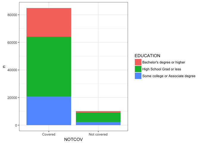
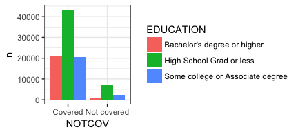
things straight from the dataframe into ggplot. Here are at least three
possible bar or column plots of EDUCATION and NOTCOV with very
little effort.
### with dplyr and ggplot
OfInterest %>%
filter(!is.na(EDUCATION), !is.na(NOTCOV)) %>%
group_by(EDUCATION,NOTCOV) %>%
count() %>%
ggplot(aes(fill=EDUCATION, y=n, x=NOTCOV)) +
geom_bar(position="dodge", stat="identity")

OfInterest %>%
filter(!is.na(EDUCATION), !is.na(NOTCOV)) %>%
group_by(EDUCATION,NOTCOV) %>%
count() %>%
ggplot(aes(fill=EDUCATION, y=n, x=NOTCOV)) +
geom_bar(stat="identity")
OfInterest %>%
filter(!is.na(EDUCATION), !is.na(NOTCOV)) %>%
group_by(EDUCATION,NOTCOV) %>%
count() %>%
ggplot(aes(fill=EDUCATION, y=n, x=NOTCOV)) +
geom_bar(stat="identity", position="fill")
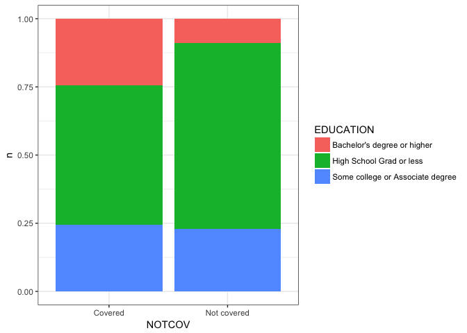
Note that with our original choice of using the table command to
create the cross tabulation that the NAs were silently discarded. With
dplyr if we don’t filter them out we will see them plotted which may
or may not be what you want substantively!
From this point forward I’m going to print the plots in a smaller size. I’m doing that via RMarkdown and it won’t happen automatically for you.
Here’s the graph with the NA’s left in place.
OfInterest %>%
# filter(!is.na(EDUCATION), !is.na(NOTCOV)) %>%
group_by(EDUCATION,NOTCOV) %>%
count() %>%
ggplot(aes(fill=EDUCATION, y=n, x=NOTCOV)) +
geom_bar(stat="identity", position="fill")
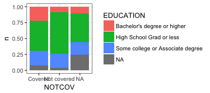
I’ll leave it up to you, the reader, to decide which graph communicates any points you want to make about the data. I also acknowledge that at this point I’ve done a poor job of labeling the plot properly. We’ll come back to that later. For now I want you to focus on a couple of areas that are ripe for automation. One is improving our ability to pass multiple variables and get multiple plots. Let’s avoid cutting and pasting the code repeatedly shall we? We could also look at letting our user choose which plot type they prefer.
Now, I happen to love using dplyr, it is so elegant, and the syntax,
plus piping, is just a joy to work with. But the downside is that it was
originally designed to be used at the command prompt interactively. It
makes heavy use of non standard evaluation NSE which makes it
tricky to program functions with.
Not impossible, but tricky. Hadley Wickham has written about it
extensively and
the Stack
Overflow
is full of questions about it, so I’m not sure I’m the person to explain
it. But I can show a practical example of how to use it. And if you’re
like me that is sometimes very helpful.
You would think (if you knew even a little bit about functions in
R) that all we
would have to do is take our code snippet from above and do some
substitution… After all it’s just simple substitution right? Trust me it
won’t work. Nor will any amount of traditional quoting, e.g. single
quotes, double quotes, etc..
#### THIS WON'T WORK ####
PlotMe <- function(dataframe,x,y){
dataframe %>%
filter(!is.na(x), !is.na(y)) %>%
group_by(x,y) %>%
count() %>%
ggplot(aes(fill=x, y=n, x=y)) +
geom_bar(position="dodge", stat="identity") ->p
plot(p)
}
PlotMe(OfInterest,EDUCATION,NOTCOV)
#### THIS WON'T WORK ####
If you read all those references above (and your head doesn’t explode) you’ll learn how it can be done. Actually the references are very good and you will learn, I’m just here to give you a very practical example using a real world scenario.
PlotMe <- function(dataframe,x,y){
aaa <- enquo(x)
bbb <- enquo(y)
dataframe %>%
filter(!is.na(!! aaa), !is.na(!! bbb)) %>%
group_by(!! aaa,!! bbb) %>%
count() %>%
ggplot(aes_(fill=aaa, y=~n, x=bbb)) +
geom_bar(position="dodge", stat="identity") ->p
plot(p) # not strictly necessary
}
PlotMe(OfInterest,EDUCATION,NOTCOV)
“Banging” out an NSE solution (pun intended)
If you compare the two functions you are immediately struck by a few
extra lines of code that include enquo, a plethora of exclamation
marks (a.k.a. “bang”) in the dplyr section and some underscores and a
tilde “~” in the ggplot section. Let’s address them in order.
When we call the PlotMe function PlotMe(OfInterest,EDUCATION,NOTCOV)
we are passing it the name of our dataset OfInterest and two bare
variables (EDUCATION,NOTCOV) N.B. it wouldn’t matter if they were
quoted we’d still have to do something. The problem is that R can’t
precisely understand what we want. It’s not 100% certain that
EDUCATION & NOTCOV are variables contained in OfInterest they
could be a lot of different things. By using enquo initially to sort
of wrap them up and then !! within our dplyr commands we can make it
clear. Let’s create a new function that isolates just the dplyr
portions of our code and ensure we’re getting a sensical answer.
JustDplyr <- function(dataframe,x,y){
aaa <- enquo(x)
bbb <- enquo(y)
dataframe %>%
filter(!is.na(!! aaa), !is.na(!! bbb)) %>%
group_by(!! aaa,!! bbb) %>%
count() -> JustAnExample
return(as.data.frame(JustAnExample))
}
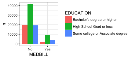
JustDplyr(OfInterest,EDUCATION,NOTCOV)
## EDUCATION NOTCOV n
## 1 Bachelor's degree or higher Covered 20802
## 2 Bachelor's degree or higher Not covered 895
## 3 High School Grad or less Covered 43404
## 4 High School Grad or less Not covered 6846
## 5 Some college or Associate degree Covered 20667
## 6 Some college or Associate degree Not covered 2313
Good. That’s what we want to see. Without the enquoting and the banging
we’ll get consistent symptoms that it doesn’t know what EDUCATION &
NOTCOV are.
ggplot like dplyr uses NSE by default to understand the data you
are passing it in the aes section of the function (see
?ggplot2::aes_). That makes our life much easier for interactive work
but necessitates aes_ in this case so we can weave it into our
function. aaa and bbb are already enquoted and using aes_ ensures
that ggplot accounts for that. ~n is the syntax for telling aes_
that it should find a variable called n inside the dataframe it is
being passed from dplyr rather than looking for some other object
named n.
#### this is just a snippet and won't run on it's own
ggplot(aes_(fill=aaa, y=~n, x=bbb)) +
geom_bar(position="dodge", stat="identity") ->p
A friendly reminder that as my tagline indicates I don’t consider myself
a “programmer”. I love analyzing data and I love R but I approach
programming slowly and cautiously. What I’m about to explain as my
method will likely seem quaint and even antiquated to some but has the
advantage of being very methodical and very practical. There are lots of
places on the web to read about this stuff, I’m simply making the case I
hope mine is slow and enough and methodical enough for a beginner.
We have a nice working function called PlotMe. We’ve proved up above
that it works and having it means that if we change something inside the
function (like add a title to our plot) it will apply itself every time.
We now face a similiar problem to the one we had the other day. We want to take our really cool new function and apply it to lots of variables, not constantly specify the pair we want. Let’s use the same tactic we did then and make two lists of which variables we want. This time I am deliberately choosing to make both lists shorter. That’s only because we’re going to draw plots eventually and they take up a lot of room on the screen.
The other key thing to notice compared to my earlier post is the use of
as.name. Since we wrote our function to accept “bare variable
names” we have to make sure to put bare variables names into the
list. Last time we used OfInterest$NOTCOV for example and R knew
exactly what that was. If you try list(NOTCOV, MEDBILL) you will fail
with an error message of Error: object 'NOTCOV' not found. If you try
depvars <- list("NOTCOV", "MEDBILL") it won’t fail it will do
worse and give you a plot that doesn’t make sense because it was
expecting a bare variable name.
PlotMe <- function(dataframe,x,y){
aaa <- enquo(x)
bbb <- enquo(y)
dataframe %>%
filter(!is.na(!! aaa), !is.na(!! bbb)) %>%
group_by(!! aaa,!! bbb) %>%
count() %>%
ggplot(aes_(fill=aaa, y=~n, x=bbb)) +
geom_bar(position="dodge", stat="identity") ->p
# plot(p) # not strictly necessary
}
depvars <- list(as.name("NOTCOV"), as.name("MEDBILL"))
indvars <- list(as.name("EARNINGS"), as.name("AGE"))
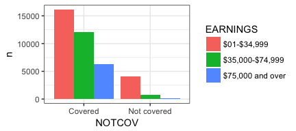
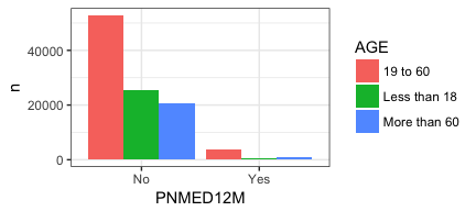
lapply (indvars, PlotMe, dataframe=OfInterest, y =NOTCOV)
## [[1]]
##
## [[2]]

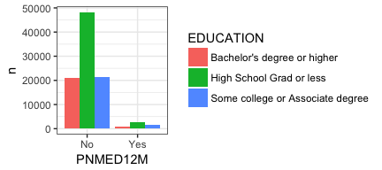
lapply (depvars, PlotMe, dataframe=OfInterest, x =EDUCATION)
## [[1]]

##
## [[2]]

#lapply(depvars, function (x) lapply(indvars, function (y) PlotMe(dataframe=OfInterest,y=y,x=x)))
Perfect! Just what we were looking for. We get back 4 plots. Progress!
No surprise it works the other way around as well. We can hold the
second part of the table command constant and just vary the independent
variable via indvars!
What we need, of course, is both of those things. A “nested” set of
calls to lapply to walk through both lists and give us all the tables
not a subset. So I tried to do what I had earlier and nest one lapply
inside another. For the astute among you you will notice I have that
line commented out. I tried to call lapply and tell it to run
lapply! The second lapply should in turn call Plotme and all we
have to do is to keep our x’s and y’s correct! Miserable failure!
Learning from failure
I did quite a few variations with no success. Perhaps one day I’ll
figure it out or one of you readers will point out the error of my ways.
But undaunted I sat back and tried to figure a way to snatch success
from this setback. The way I saw it I had at least two problems. One,
the fact that the nested lapply wasn’t working but also that my
process was just tedious. Building lists of variable names (quoted or
bare) gets tedious. It’s a lot of typing and prone to errors. Perhaps
I’d have more luck if I used the fact that each of the columns in a
dataframe is also numbered… OfInterest[,1] corresponds to AGE. Maybe
a more efficient way of approaching this problem was to take the
dependent variable column numbers and cross them with the independent
variable column numbers OfInterest[,c(1,3:4,7)] looked like a lot less
typing than expressing AGE SEX EDUCATION PNMED12M. So the first two
lines of code below put the right variables in xwhich and ywhich and
are easy to verify!
head(OfInterest[,c(6:9)])
## PDMED12M PNMED12M NOTCOV MEDBILL
## 1 No No Covered No
## 2 Yes No Covered Yes
## 3 No No Covered Yes
## 4 No No Covered Yes
## 5 No No Covered Yes
## 6 No No Covered No
xwhich <- c(6:9)
head(OfInterest[,c(1,4,5)])
## AGE EDUCATION EARNINGS
## 1 19 to 60 Some college or Associate degree $01-$34,999
## 2 19 to 60 High School Grad or less $35,000-$74,999
## 3 19 to 60 Bachelor's degree or higher $35,000-$74,999
## 4 Less than 18 High School Grad or less <NA>
## 5 Less than 18 <NA> <NA>
## 6 19 to 60 Bachelor's degree or higher $75,000 and over
ywhich <- c(1,4,5)
Now we have two vectors. Each of them is a set of integers for the
columns that we are interested in. Our PlotMe function is actually
expecting a bare variable name but we can produce that by using the
colnames function colnames(OfInterest[xwhich[[1]]]) gives us the
name of the column in OfIinterest that corresponds to the first
element of our xwhich vector.
# First element of the vector (6)
xwhich[[1]]
## [1] 6
# The name of the column in OfInterest which corresponds to 6 quoted "PDMED12M"
colnames(OfInterest[xwhich[[1]]])
## [1] "PDMED12M"
# The name of the column in OfInterest which corresponds to 6 bare PDMED12M
as.name(colnames(OfInterest[xwhich[[1]]]))
## PDMED12M
Okay now we know how to move between column number and column name in
two ways. That still doesn’t solve our problem with lapply. But
lapply is part of a family of functions and it turns out that one of
its siblings is mapply. When we look at the documentation for
?mapply we see that it takes two or more lists and applies them to a
function. So rather than trying to nest our call we could conceivably
pass our PlotMe function two lists. One that contains our list of
dependent variables in the right order and the other list our
independent variables. First, what we need to do is “cross” them so that
we get two lists of 12. Each of the lists will repeat itself as needed.
We can use a for loop to build the lists. So our steps are:
- Initialize an empty list for both our independent and dependent variables.
- Create a counter so the lists stay aligned.
- Use the
for loopwith theas.name(colnames(OfInterest[xwhich[[j]]]))type call to put things in our list where they belong.
To make things easy to follow I have added a cat statement that will
print 12 times as we do this.
indvars<-list() # create empty list to add to
depvars<-list() # create empty list to add to
totalcombos <- 1 # keep track of where we are
for (j in seq_along(xwhich)) {
  for (k in seq_along(ywhich)) {
    depvars[[totalcombos]] <- as.name(colnames(OfInterest[xwhich[[j]]]))
    indvars[[totalcombos]] <- as.name(colnames(OfInterest[ywhich[[k]]]))
    cat("iteration #", totalcombos,
        " xwhich=", xwhich[[j]], " depvars = ", as.name(colnames(OfInterest[xwhich[[j]]])),
        " ywhich=", ywhich[[k]], " indvars = ", as.name(colnames(OfInterest[ywhich[[k]]])),
        "\n", sep = "")
    totalcombos <- totalcombos +1
  }
}
## iteration #1 xwhich=6 depvars = PDMED12M ywhich=1 indvars = AGE
## iteration #2 xwhich=6 depvars = PDMED12M ywhich=4 indvars = EDUCATION
## iteration #3 xwhich=6 depvars = PDMED12M ywhich=5 indvars = EARNINGS
## iteration #4 xwhich=7 depvars = PNMED12M ywhich=1 indvars = AGE
## iteration #5 xwhich=7 depvars = PNMED12M ywhich=4 indvars = EDUCATION
## iteration #6 xwhich=7 depvars = PNMED12M ywhich=5 indvars = EARNINGS
## iteration #7 xwhich=8 depvars = NOTCOV ywhich=1 indvars = AGE
## iteration #8 xwhich=8 depvars = NOTCOV ywhich=4 indvars = EDUCATION
## iteration #9 xwhich=8 depvars = NOTCOV ywhich=5 indvars = EARNINGS
## iteration #10 xwhich=9 depvars = MEDBILL ywhich=1 indvars = AGE
## iteration #11 xwhich=9 depvars = MEDBILL ywhich=4 indvars = EDUCATION
## iteration #12 xwhich=9 depvars = MEDBILL ywhich=5 indvars = EARNINGS
That looks like what we want. Two lists with the column names varying in
the way we want them. Let’s try passing it all to our PlotMe function
to see if we get our 12 plots back as desired. The documentation says we
use mapply as follows mapply(FUN, ..., MoreArgs = NULL) which for us
translates to FUN=Plotme, x=indvars , y=depvars , MoreArgs =
list(dataframe=OfInterest) or
mapply(PlotMe,x=indvars,y=depvars,MoreArgs =
list(dataframe=OfInterest))
. N.B. notice that our plot(p) has now
become mandatory. Why that’s important in the next section.
PlotMe <- function(dataframe,x,y){
  aaa <- enquo(x)
  bbb <- enquo(y)
  dataframe %>%
    filter(!is.na(!! aaa), !is.na(!! bbb))  %>%
    group_by(!! aaa,!! bbb) %>%
    count() %>%
  ggplot(aes_(fill=aaa, y=~n, x=bbb)) +
    geom_bar(position="dodge", stat="identity") ->p
    plot(p) # now necessary
    # invisible(return(p))
    # NULL
    # return(print("Printing plot to default device"))
}
invisible(mapply(PlotMe,x=indvars,y=depvars,MoreArgs = list(dataframe=OfInterest)))
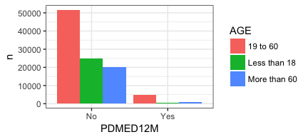
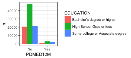
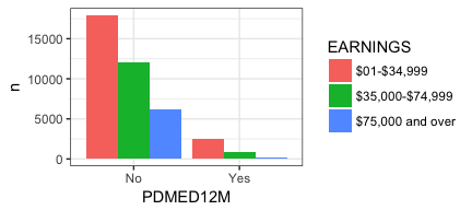

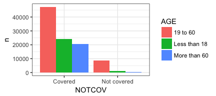


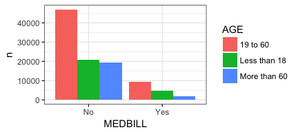
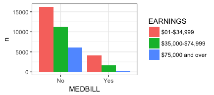
Eureka! There are our 12 charts! But you will notice I added a few more lines of code that need explanation …
# invisible(return(p))
# NULL
# return(print("Printing plot to default device"))
invisible(mapply(PlotMe,x=indvars,y=depvars,MoreArgs =
list(dataframe=OfInterest)))
The explanation for these is that they control what output you get back when you run these commands. Without actually running them here I suggest you try them yourself to see that you can choose to receive back several different options.
whatdidIgetback <- invisible(mapply(PlotMe,x=indvars,y=depvars,MoreArgs = list(dataframe=OfInterest)))
whatdidIgetback
All done (not yet!)
This has become a very long post so I’m going to end here. Next post I’ll address letting the user choose which type of plot they’d like, create more appropriate titles and labels, as well as adding some basic error checking to our function.
I hope you’ve found this useful. I am always open to comments, corrections and suggestions.
Chuck (ibecav at gmail dot com)
License

This
work is licensed under a
Creative
Commons Attribution-ShareAlike 4.0 International License.