Fun with M&M's – April 3, 2018
Tagged as: [In this post we’re going to explore the Chi Squared Goodness of Fit
test using M&M’s as our subject material. From there we’ll take a look
at simultaneous confidence intervals a.k.a. multiple comparisons. On
the R side of things we’ll make use of some old friends like ggplot2
and dplyr but we’ll also make use of two packages that were new to me
scimp and ggimage. We’ll also make heavy use of the kable package
to make our output tables look nicer.
Background and credits
See this blog post by Rick
Wicklin
for the full background story. This posting is simply an attempt to do
the same sort of analysis in R. It is an expansion of work that Bob
Rudis did on RPubs.
Let’s load the required R packages. See Bob Rudis’ Github pages for more on scimple. Let’s take care of housekeeping and set up the right libraries.
library(knitr)
library(kableExtra)
# devtools::install_github("hrbrmstr/scimple")
library(scimple)
library(hrbrthemes) # for scales
# I had to install Image Magick first on my Mac as well as EBImage
# https://bioconductor.org/packages/release/bioc/html/EBImage.html
# install.packages("ggimage")
library(ggimage)
library(dplyr)
library(ggplot2)

options(knitr.table.format = "html")
cap_src <- "Source: <http://blogs.sas.com/content/iml/2017/02/20/proportion-of-colors-mandms.html>"
SAS M&M’s Measurements
The breakroom containers at SAS are filled from two-pound bags. So as to not steal all the M&M’s in the breakroom, [Rick] conducted this experiment over many weeks in late 2016 and early 2017, taking one scoop of M&M’s each week.
Create a dataframe called mms that contains information about:
| Column | Contains | Type |
|---|---|---|
| color_name | What color M&M | factor |
| official_color | color as hex code according to Mars standards | char |
| count | observed frequency counts in SAS breakrooms | dbl |
| prop_2008 | expected freq as a % (Mars 2008) | dbl |
| imgs | filenames for the M&M lentils | char |
| prop | convert observed counts to proportions | dbl |
mms <- data_frame(
  color_name = c("Red", "Orange", "Yellow", "Green", "Blue", "Brown"),
  official_color = c("#cb1634", "#eb6624", "#fff10a", "#37b252", "#009edd", "#562f14"),
  count = c(108, 133, 103, 139, 133, 96),
  prop_2008 = c(0.13, 0.20, 0.14, 0.16, 0.24, 0.13),
  imgs=c("im-red-lentil.png", "im-orange-lentil.png", "im-yellow-lentil.png",
         "im-green-lentil.png", "im-blue-lentil.png", "im-brown-lentil.png")
) %>%
  mutate(prop = count / sum(count),
         color_name = factor(color_name, levels=color_name))
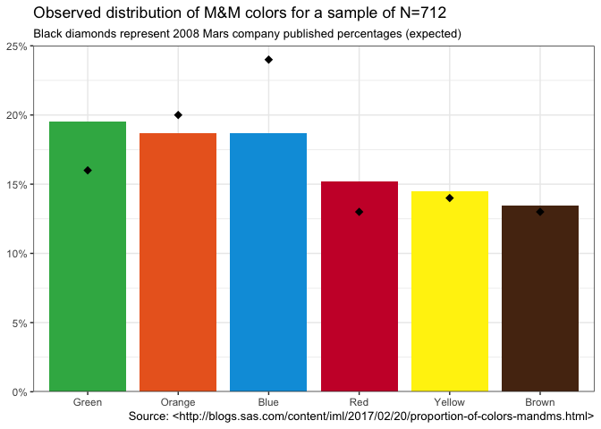
The data set contains the cumulative counts for each of the six colors in a sample of size N = 712. Let’s graph the observed percentages as bars (ordered by frequency) and the expected percentages that Mars published in 2008 as black diamonds.
ggplot(mms, aes(reorder(color_name,-prop), prop, fill=official_color)) +
  geom_col(width=0.85) +
  geom_point(aes(color_name,prop_2008),shape=18,size = 3) +
  scale_y_percent(limits=c(0, 0.25)) +
  scale_fill_identity(guide = FALSE) +
  labs(x=NULL, y=NULL,
       title=sprintf("Observed distribution of M&M colors for a sample of N=%d", sum(mms$count)),
       subtitle="Black diamonds represent 2008 Mars company published percentages (expected)",
       caption=cap_src) +
  theme_bw()
 M&M Bargraph
The same data as a table:
mms %>%
  arrange(desc(count)) %>%
  mutate(difference=prop-prop_2008,
         difference=scales::percent(difference),
         prop=scales::percent(prop),
         prop_2008=scales::percent(prop_2008)
         ) %>%
  select(Color=color_name, Observed=count, `Observed %`=prop, `Expected %`=prop_2008, Difference=difference) %>%
  kable(align="lrrrr") %>%
  kable_styling(full_width = FALSE)
| Color | Observed | Observed % | Expected % | Difference |
|---|---|---|---|---|
| Green | 139 | 19.52% | 16% | 3.52% |
| Orange | 133 | 18.68% | 20% | -1.32% |
| Blue | 133 | 18.68% | 24% | -5.32% |
| Red | 108 | 15.17% | 13% | 2.17% |
| Yellow | 103 | 14.47% | 14% | 0.47% |
| Brown | 96 | 13.48% | 13% | 0.48% |
Chi-Squared Goodness of Fit Test Results
Whether we look at the results in a graph or a table there are clearly
differences between expected and observed for most of the colors. We
would expect to find some differences but the overall question is do our
data fit the “model” that is inherent in the expected 2008 data we
have from Mars? The statistical test for this is the Chi-Square
Goodness of Fit (GoF). Let’s run it on our data. We give the test our
observed counts mms$count as well as p=mms$prop_2008 which indicates
what our expected probabilities (proportions) are. If we didn’t specify
then the test would be run against the hypothesis that they M&M’s were
equally likely. The broom::tidy() takes the output from the Chi Square
test converts it to a data frame and allows us to present it neatly
using kable.
chisq.test(mms$count, p=mms$prop_2008) %>%
  broom::tidy() %>%
  select(`Chi Squared`=statistic, `P Value`=p.value, `Degrees of freedom`=parameter,
                `R method`=method) %>%
  kable(align = "rrcl",digits=3) %>%
  kable_styling(full_width = FALSE)
| Chi Squared | P Value | Degrees of freedom | R method |
|---|---|---|---|
| 17.353 | 0.004 | 5 | Chi-squared test for given probabilities |
We can reject the null hypothesis at the alpha = 0.05 significance level (95% confidence). In other words, the distribution of colors for M&M’s in this 2016/2017 sample does NOT appear to be the same as the color distribution we would expect given the data from Mars published in 2008!
The data provide support for the hypothesis that the overall distribution doesn’t match what Mars said it should be. That’s exciting news, but leaves us with some other unanswered questions. One relatively common question is, how “big” is the difference or the effect? Is this a really big discrepancy between the published data and our sample? Is there a way of knowing how big this difference is?
Let’s start answering the second question first. Effect size is a
measure we use in statistics to express how big the differences are. For
this test the appropriate measure of effect size is Cohen’s w
which can be
calculated from the Chi squared statistic and N.
chisquaredresults<-broom::tidy(chisq.test(mms$count, p=mms$prop_2008))
chisquaredvalue<-chisquaredresults$statistic
N<-sum(mms$count)
cohensw<-sqrt(chisquaredvalue/N)
cohensw
## [1] 0.1561162
So our value for Cohen’s w is 0.156 . The rule of thumb for interpreting this number indicates that this is a small effect size https://stats.idre.ucla.edu/other/mult-pkg/faq/general/effect-size-power/faqhow-is-effect-size-used-in-power-analysis/. Obviously you should exercise professional judgment in interpreting effect size but it does not appear that the differences are worthy of a world wide expose at this time…
On to our other question…
Is there a way of telling by color which quantities of M&M’s are significantly different? After all a cursory inpsection of the graph or the table says that green and blue seem to be “off” quite a bit while yellow and brown are really close to what we would expect! Is there a way, now that we have conducted an overall omnibuds test of the goodness of fit (GOF), we can refine our understanding of the differences color by color?
Simultaneous confidence intervals for the M&M proportions (multiple comparisons)
Any sample is bound have some random variability compared to the true population count or percentage. How can we use confidence intervals to help us understand whether the data are indicating simple random variation or whether the underlying population is different. By now you no doubt have thought of confidence intervals. We just need to compute the confidence interval for each color and then see whether the percentages provided by Mars lie inside or outside the confidence interval our sample generates. We would expect that if we ran our experiment 100 times with our sample size numbers for each color the Mars number would lie inside the upper and lower limit of our confidence interval 95 times out of those 100 times. If our data shows it outside the confidence interval that is evidence of a statistically significant difference.
Ah, but there’s a problem! We have 6 colors and we would like to test
each color to see if it varies significantly. Assuming we want to have
95% confidence again, across all six colors, we are “cheating” if we
compute a simple confidence interval and then run the test six times.
It’s analogous to rolling the die six times instead of once. The more
tests we run the more likely we are to find a difference even though
none exists. We need to adjust our confidence to account for the fact
that we are making multiple comparisons (a.k.a. simultaneous
comparisons). Our confidence interval must be made wider (more
conservative) to account for the fact we are making multiple
simultaneous comparisons. Thank goodness the tools exist to do this for
us. As a matter of fact there is no one single way to make the
adjustment… there are
many.
We’re going to focus on Goodman.
In his original posting Rick used SAS scripts he had written for a
previous blog post to overcome this challenge. As R users we have a few
different packages for computing simultaneous confidence intervals (as
well as the option of simply doing the calculations in base R). Bob
Rudis took a look at several different choices in R packages but one
of the “better” ones CoinMinD does the computations nicely and then
prints out the results (literally with print()) as opposed to
returning data we can act upon. So he made a new
package that does the same
computations and returns tidy data frames for the confidence intervals.
The package is much cleaner and it includes a function that can compute
multiple SCIs and return them in a single data frame, similar to what
binom::binom.confint() does.
Here are a couple examples of scimple in action. We’ll feed it the
counts mms$count we have, and ask it to use the Goodman method for
computing the confidence interval for each of the six colors assuming we
want 95% confidence alpha = .05. For comparison we’ll also run the Wald
method with continuity correction.
The command is scimp_goodman(mms$count, alpha=0.05). I’ve added a
select statement to remove some columns for clarity. The
scimp_waldcc(mms$count, alpha=0.05) shows you the more verbose output
for Wald.
scimp_goodman(mms$count, alpha=0.05) %>%
  select( `95% Lower`=lower_limit, `95% Upper`=upper_limit) %>%
  kable(align = "lrrrrr",caption = "Goodman Method") %>%
  kable_styling(full_width = FALSE)
| 95% Lower | 95% Upper |
|---|---|
| 0.1196016 | 0.1905134 |
| 0.1513616 | 0.2282982 |
| 0.1133216 | 0.1828844 |
| 0.1590634 | 0.2372872 |
| 0.1513616 | 0.2282982 |
| 0.1045758 | 0.1721577 |
scimp_waldcc(mms$count, alpha=0.05) %>%
  kable(align = "lrrrrr",caption = "Wald Continuity Correction") %>%
  kable_styling(full_width = FALSE)
| method | lower_limit | upper_limit | adj_ll | adj_ul | volume |
|---|---|---|---|---|---|
| waldcc | 0.1246345 | 0.1787363 | 0.1246345 | 0.1787363 | 0 |
| waldcc | 0.1574674 | 0.2161281 | 0.1574674 | 0.2161281 | 0 |
| waldcc | 0.1181229 | 0.1712030 | 0.1181229 | 0.1712030 | 0 |
| waldcc | 0.1654077 | 0.2250417 | 0.1654077 | 0.2250417 | 0 |
| waldcc | 0.1574674 | 0.2161281 | 0.1574674 | 0.2161281 | 0 |
| waldcc | 0.1090419 | 0.1606210 | 0.1090419 | 0.1606210 | 0 |
For each of the commands, back comes a tibble with six rows (one for
each color) with the upper and lower bounds as well as other key data
from the process for each method. Notice that the confidence interval
width varies by color (row in the tibble) based on observed sample size
and that the Goodman intervals are wider (more conservative) when you
compare rows across tables with the Wald Continuity Correction method.
The documentation on GitHub https://github.com/hrbrmstr/scimple that Bob Rudis provided has a nice graph that shows you the 6 different methods and how they would place the confidence intervals for the exact same observed data. Clearly YMMV depending on which method you choose.
Armed with this great package that Bob provided let’s bind these corrected confidence intervals to the data we have and see if we can determine whether our intuitions about which colors are significantly different from the expected values are accurate…
mms <- bind_cols(mms, scimp_goodman(mms$count, alpha=0.05))
mms %>%
  select(Color=color_name,
         Observed=count,
         Percent=prop,
        `95% Lower`=lower_limit,
        `95% Upper`=upper_limit,
        Expected=prop_2008) %>%
  kable(align=c("lrrrrr"), digits=3, caption="Simultaneous confidence Intervals (Goodman method)") %>%
  kable_styling(full_width = FALSE, position = "center")
| Color | Observed | Percent | 95% Lower | 95% Upper | Expected |
|---|---|---|---|---|---|
| Red | 108 | 0.152 | 0.120 | 0.191 | 0.13 |
| Orange | 133 | 0.187 | 0.151 | 0.228 | 0.20 |
| Yellow | 103 | 0.145 | 0.113 | 0.183 | 0.14 |
| Green | 139 | 0.195 | 0.159 | 0.237 | 0.16 |
| Blue | 133 | 0.187 | 0.151 | 0.228 | 0.24 |
| Brown | 96 | 0.135 | 0.105 | 0.172 | 0.13 |
Hmmm, the table shows that only blue (0.24) is outside the 95%
confidence interval, with green (0.16) just barely inside its interval.
The rest are all somewhere inside the confidence interval range. We
could of course choose a less stringent or conservative method than
Goodman. Or we could choose and even stricter method! That exercise is
left to you. For now though I find the table of numbers hard to read and
to parse so let’s build a plot that hopefully makes our life a little
easier. Later we’ll make use of ggimage and some work that Bob did to
make an even better plot.
mms %>%
  ggplot() +
  geom_segment(aes(x=lower_limit, xend=upper_limit, y=color_name,
                   yend=color_name, color=official_color), size=3) +
  geom_point(aes(prop, color_name, fill=official_color),
              size=8, shape=21, color="white") +
  geom_point(aes(prop_2008, color_name, color=official_color),
             shape="|", size=8) +
  scale_x_percent(limits=c(0.095, 0.25)) +
  scale_color_identity(guide = FALSE) +
  scale_fill_identity(guide = FALSE) +
  labs(x="Proportion", y=NULL,
       title="Observed vs Expected 2008 for M&M Candies",
       subtitle=sprintf("95%% Simultaneous Confidence Intervals, [N=%d]",
                        sum(mms$count)), caption=cap_src) +
  theme_bw()
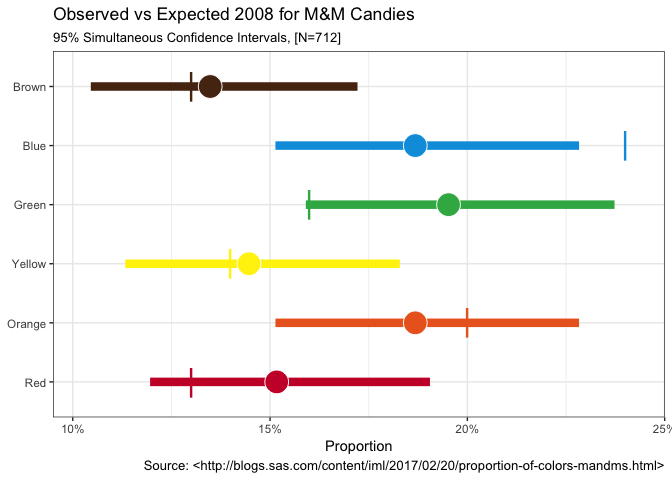
Ah, that’s better sometimes a picture really is worth a thousand numbers… We can now clearly see the observed percent as a circle. The Goodman adjusted confidence interval as a horizontal line and the expected value from the 2008 Mars information as a nice vertical line.
Plot twist – The Cleveland Comparison
So as it turns out, Rick the original author at SAS was able to make contact with the Mars Company and determine that there really was an explanation for the differences. Turns out some changes were made and there are actually two places where these M&M’s might have originated each with slightly different proportions! Who knew? Right?
Let’s take the opportunity to take our new data and the ggimage
package and plot the plot twist (pun intended). All credit to Bob for
carefully constructing the right commands to ggplot to make this
compelling graphic. All we have to do is add the Cleveland plant
expected proportions as cleveland_prop to our data since our observed
hasn’t changed which means our CI’s remain the same.
url_base <- "http://www.mms.com/Resources/img/"

mms %>%
  mutate(imgs=sprintf("%s%s", url_base, imgs)) %>%
  mutate(cleveland_prop=c(0.131, 0.205, 0.135, 0.198, 0.207, 0.124)) %>%
  ggplot() +
  geom_segment(aes(x=lower_limit, xend=upper_limit, y=color_name,
                   yend=color_name, color=official_color), size=2) +
  geom_image(aes(prop, color_name, image=imgs),size=.10) +
  geom_point(aes(cleveland_prop, color_name, color=official_color),
             shape="|", size=6) +
  scale_x_percent(limits=c(0.095, 0.25)) +
  scale_color_identity(guide = FALSE) +
  scale_fill_identity(guide = FALSE) +
  labs(x="Proportion", y=NULL,
       title="Observed vs 2017 Proportions for M&M Candies",
       subtitle=sprintf("95%% Simultaneous Confidence Intervals, [N=%d]",
                        sum(mms$count)), caption=cap_src) +
  theme_bw()
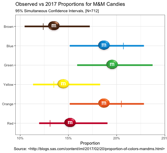
Certainly a more intriguing graphic now that we let ggimage put the
lentils in there for us…
I hope you’ve found this useful. I am always open to comments, corrections and suggestions.
Chuck (ibecav at gmail dot com)
License

This
work is licensed under a
Creative
Commons Attribution-ShareAlike 4.0 International License.