Slopegraphs and R -- A pleasant diversion -- May 26, 2018
Tagged as: [I try to at least scan the R-bloggers feed everyday. Not every article is of interest to me, but I often have one of two different reactions to at least one article. Sometimes it is an “ah ha” moment because the article is right on point for a problem I have now or have had in the past and the article provides a (better) solution. Other times my reaction is more of an “oh yeah”, because it is something I have been meaning to investigate, or something I once knew, but the article brings a different perspective to it.
The second case happened to me this week. I’ve been aware of slopegraphs and bumpcharts for quite some time, and I certainly am aware of Tufte’s work. As an amateur military historian I’ve always loved, for example, his poster depicting Napoleon’s Russian Campaign. So when I saw the article from Murtaza Haider titled “Edward Tufte’s Slopegraphs and political fortunes in Ontario” I just had to take a peek and revisit the topic.
The article does a good job of looking at slopegraphs in both R (via
plotrix) and Stata, even providing the code to do the work. My
challenge was that even though I’m adequate at plotting in base R, I
much prefer using ggplot2 wherever and whenever possible. My memory
was that I had seen another article on the related topic of a
bumpchart on R-bloggers in the not too distant past. A little
sleuthing turned up this earlier
article from Dominik
Koch who wrote some code to
compare national performance at the Winter Olympics, “Bump Chart -
Track performance over time”.
Finally, I wound up at this Github
repository for a project called
“Edward Tufte-Inspired Slopegraphs” from Thomas J.
Leeper who has been building code to make
slopegraphs using both base plotting functions and ggplot2.
My post today will draw a little bit from all their work and hopefully
provide some useful samples for others to draw on if they share some of
my quirks about data layout and a preference for ggplot2 versus base
plot. I’m going to focus almost exclusively on slopegraphs, although
much of the work could be extended to bumpcharts as well.
Setup and library loading
We’re going to make occasional use of dplyr to manipulate the data,
extensive use of ggplot2 to do the plotting and ggrepel to solve one
specific labeling problem. We’ll load them and I am suppressing the
message from dplyr about namespace overrides.
require(dplyr)
require(ggplot2)
require(ggrepel)
require(kableExtra)
Politics in Ontario
The original
post
is about plotting the data from some polling results in Ontario. For the
reader’s convenience I’ve made the data available via a structure
command. We have data about two different polling dates, for 5 political
parties, and the measured variable is percent of people supporting
expressed as x.x (i.e. already multiplied by
100).
data <- structure(list( Date = structure(c(1L, 1L, 1L, 1L, 1L, 2L, 2L, 2L, 2L, 2L),
                                        .Label = c("11-May-18", "18-May-18"),
                                        class = "factor"),
                        Party = structure(c(5L, 3L, 2L, 1L, 4L, 5L, 3L, 2L, 1L, 4L),
                                         .Label = c("Green", "Liberal", "NDP", "Others", "PC"),
                                         class = "factor"),
                        Pct = c(42.3, 28.4, 22.1, 5.4, 1.8, 41.9, 29.3, 22.3, 5, 1.4)),
                  class = "data.frame",
                  row.names = c(NA, -10L))

str(data)
## 'data.frame':    10 obs. of  3 variables:
##  $ Date : Factor w/ 2 levels "11-May-18","18-May-18": 1 1 1 1 1 2 2 2 2 2
##  $ Party: Factor w/ 5 levels "Green","Liberal",..: 5 3 2 1 4 5 3 2 1 4
##  $ Pct  : num  42.3 28.4 22.1 5.4 1.8 41.9 29.3 22.3 5 1.4
head(data)
##        Date   Party  Pct
## 1 11-May-18      PC 42.3
## 2 11-May-18     NDP 28.4
## 3 11-May-18 Liberal 22.1
## 4 11-May-18   Green  5.4
## 5 11-May-18  Others  1.8
## 6 18-May-18      PC 41.9
Let’s just take the data as we have it and feed it to ggplot in a nice
simple fashion and see what we get with very little effort.
ggplot(data = data, aes(x = Date, y = Pct, group = Party)) +
  geom_line(aes(color = Party, alpha = 1), size = 2) +
  geom_point(aes(color = Party, alpha = 1), size = 4) +
  #  Labelling as desired
  labs(
    title = "Voter's stated preferences for June 7 elections in Ontario",
    subtitle = "(Mainstreet Research)",
    caption = "https://www.mainstreetresearch.ca/gap-between-ndp-and-pcs-narrows-while-liberals-hold-steady/"
  )
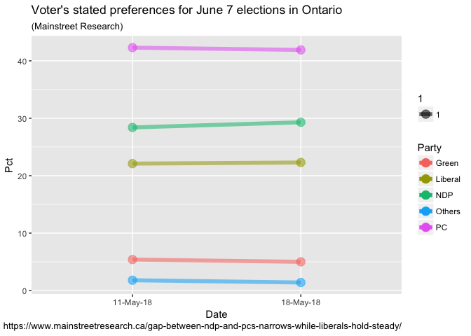
The nice thing about ggplot is once you get used to the syntax it
becomes very “readable”. We’ve identified our dataset, the x & y
variables and our grouping variable. Lines too big? An adjustment to
size = 2 does it. Don’t like colors? Pull the color = Party clause.
So we’re already pretty close to what we need. Things are scaled
properly and the basic labeling of titles etc. is accomplished. Our
biggest “problem” is that ggplot has been a little too helpful and
adding some things we’d like to remove to give it a more “Tuftesque”
look. So what we’ll do in the next few steps is add lines of code – but
they are mainly designed to remove unwanted elements. This is in
contrast to a base plot where we have to write the code to add elements.
So lets:
- Move the x axis labels to the top with
scale_x_discrete(position = "top") - Change to a nice clean black and white theme
theme_bw() - Not display any legend(s)
theme(legend.position = "none") - Remove the default border from our plot
theme(panel.border =
element_blank())
ggplot(data = data, aes(x = Date, y = Pct, group = Party)) +
  geom_line(aes(color = Party, alpha = 1), size = 2) +
  geom_point(aes(color = Party, alpha = 1), size = 4) +
  # move the x axis labels up top
  scale_x_discrete(position = "top") +
  theme_bw() +
  # Format tweaks
  # Remove the legend
  theme(legend.position = "none") +
  # Remove the panel border
  theme(panel.border     = element_blank()) +
  #  Labelling as desired
  labs(
    title = "Voter's stated preferences for June 7 elections in Ontario",
    subtitle = "(Mainstreet Research)",
    caption = "https://www.mainstreetresearch.ca/gap-between-ndp-and-pcs-narrows-while-liberals-hold-steady/"
  )
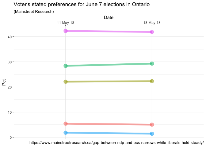
Nice progress! Continuing to remove things that can be considered
“clutter” we add some additional lines that all end in
element_blank() and are invoked to remove default plot items such as
the plot grid, the y axcis text, etc..
ggplot(data = data, aes(x = Date, y = Pct, group = Party)) +
  geom_line(aes(color = Party, alpha = 1), size = 2) +
  geom_point(aes(color = Party, alpha = 1), size = 4) +
  # move the x axis labels up top
  scale_x_discrete(position = "top") +
  theme_bw() +
  # Format tweaks
  # Remove the legend
  theme(legend.position = "none") +
  # Remove the panel border
  theme(panel.border     = element_blank()) +
  # Remove just about everything from the y axis
  theme(axis.title.y     = element_blank()) +
  theme(axis.text.y      = element_blank()) +
  theme(panel.grid.major.y = element_blank()) +
  theme(panel.grid.minor.y = element_blank()) +
  # Remove a few things from the x axis and increase font size
  theme(axis.title.x     = element_blank()) +
  theme(panel.grid.major.x = element_blank()) +
  theme(axis.text.x.top      = element_text(size=12)) +
  # Remove x & y tick marks
  theme(axis.ticks       = element_blank()) +
  #  Labelling as desired
  labs(
    title = "Voter's stated preferences for June 7 elections in Ontario",
    subtitle = "(Mainstreet Research)",
    caption = "https://www.mainstreetresearch.ca/gap-between-ndp-and-pcs-narrows-while-liberals-hold-steady/"
  )
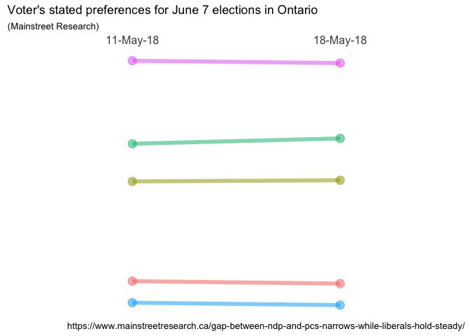
Very nice! We’re almost there! The “almost” is because now that we
have removed both the legend and all scales and tick marks we no longer
know who is who, and what the numbers are! Plus, I’m a little unhappy
with the way the titles are formatted, so we’ll play with that. Later,
I’ll get fancy but for now let’s just add some simple text labels on
the left and right to show the party name and their percentage. The code
geom_text(aes(label = Party)) will place the party name right on top
of the points that anchor either end of the line. If we make that
geom_text(aes(label = paste0(Party, " - ", Pct, "%"))) then we’ll get
labels that have both the party and the percent all neatly formatted,
but still right on top of the points that anchor the ends of the line.
hjust controls horizontal justification so if we change it to
geom_text(aes(label = paste0(Party, " - ", Pct, "%")), hjust = 1.35)
both sets of labels will slide to the left which is exactly what we want
for the May 11 labels but not the May 18 labels. If we feed hjust a
negative number they’ll go the other way. So what we’ll do is filter the
data using the filter function from dplyr and place the left hand
labels differently than the right hand labels. While we’re at it we’ll
make it bold face font and a little larger…
ggplot(data = data, aes(x = Date, y = Pct, group = Party)) +
  geom_line(aes(color = Party, alpha = 1), size = 2) +
  geom_point(aes(color = Party, alpha = 1), size = 4) +
  geom_text(data = data %>% filter(Date == "11-May-18"),
            aes(label = paste0(Party, " - ", Pct, "%")) ,
            hjust = 1.35,
            fontface = "bold",
            size = 4) +
  geom_text(data = data %>% filter(Date == "18-May-18"),
            aes(label = paste0(Party, " - ", Pct, "%")) ,
            hjust = -.35,
            fontface = "bold",
            size = 4) +
  # move the x axis labels up top
  scale_x_discrete(position = "top") +
  theme_bw() +
  # Format tweaks
  # Remove the legend
  theme(legend.position = "none") +
  # Remove the panel border
  theme(panel.border     = element_blank()) +
  # Remove just about everything from the y axis
  theme(axis.title.y     = element_blank()) +
  theme(axis.text.y      = element_blank()) +
  theme(panel.grid.major.y = element_blank()) +
  theme(panel.grid.minor.y = element_blank()) +
  # Remove a few things from the x axis and increase font size
  theme(axis.title.x     = element_blank()) +
  theme(panel.grid.major.x = element_blank()) +
  theme(axis.text.x.top      = element_text(size=12)) +
  # Remove x & y tick marks
  theme(axis.ticks       = element_blank()) +
  # Format title & subtitle
  theme(plot.title       = element_text(size=14, face = "bold", hjust = 0.5)) +
  theme(plot.subtitle    = element_text(hjust = 0.5)) +
  #  Labelling as desired
  labs(
    title = "Voter's stated preferences for June 7 elections in Ontario",
    subtitle = "(Mainstreet Research)",
    caption = "https://www.mainstreetresearch.ca/gap-between-ndp-and-pcs-narrows-while-liberals-hold-steady/"
  )
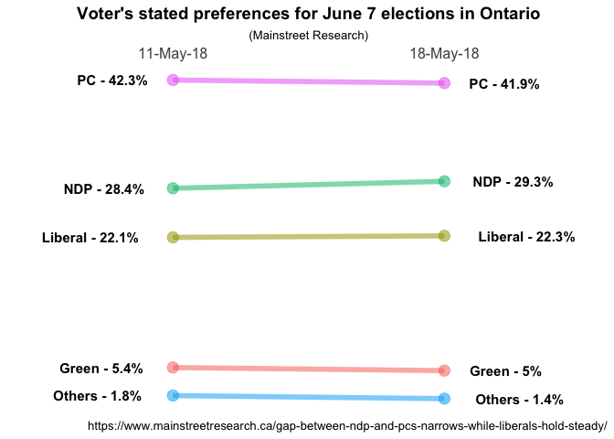
Eureka! Not perfect yet but definitely looking good.
Adding complexity
I’m feeling pretty good about the solution so far but there are three things I’d like to make better.
- How well will this solution work when we have more than two time periods? Need to make sure it generalizes to a more complex case.
- As Murtaza Haider notes in his post we’ll have issues if the data points are identical or very close together. Our very neat little labels will overlap each other. In his post I believe he mentions that he manually moved them in some cases. Let’s try and fix that.
- Oh my, that’s a lot of code to keep cutting and pasting, can we simplify?
To test #1 and #2 I have “invented”” a new dataset called moredata.
It is fictional it’s labelled May 25th but today is actually May
24th. But I created it to add a third polling date and to make sure that
we had a chance to test what happens when we have two identical
datapoints on the same day. Notice that on May 25th the polling numbers
for the Liberals and the NDP are identical at
26.8%.
moredata <- structure(list(Date = structure(c(1L, 1L, 1L, 1L, 1L, 2L, 2L, 2L, 2L, 2L, 3L, 3L, 3L, 3L, 3L),
                                            .Label = c("11-May-18", "18-May-18", "25-May-18"),
                                            class = "factor"),
                           Party = structure(c(5L, 3L, 2L, 1L, 4L, 5L, 3L, 2L, 1L, 4L, 5L, 3L, 2L, 1L, 4L),
                                             .Label = c("Green", "Liberal", "NDP", "Others", "PC"),
                                             class = "factor"),
                           Pct = c(42.3, 28.4, 22.1, 5.4, 1.8, 41.9, 29.3, 22.3, 5, 1.4, 41.9, 26.8, 26.8, 5, 1.4)),
                      class = "data.frame",
                      row.names = c(NA, -15L))
tail(moredata)
##         Date   Party  Pct
## 10 18-May-18  Others  1.4
## 11 25-May-18      PC 41.9
## 12 25-May-18     NDP 26.8
## 13 25-May-18 Liberal 26.8
## 14 25-May-18   Green  5.0
## 15 25-May-18  Others  1.4
You’ll notice at the beginning of this post I loaded the ggrepel
library. ggrepel works with ggplot2 to repel things that overlap,
in this case our geom_text labels. The invocation is geom_text_repel
and it is very similar to geom_text but allows us to deconflict the
overlaps. We’ll use hjust = "left" and hjust = "right" to control
justifying the labels. We’ll use a fixed nudge left and right nudge_x =
-.45 and nudge_x = .5 to move the labels left and right off the
plotted data points and we will explicitly tell geom_text_repel to
only move the labels vertically to avoid overlap with direction = "y".
Everything else remains the same.
ggplot(data = moredata, aes(x = Date, y = Pct, group = Party)) +
geom_line(aes(color = Party, alpha = 1), size = 2) +
geom_point(aes(color = Party, alpha = 1), size = 4) +
geom_text_repel(data = moredata %>% filter(Date == "11-May-18"),
aes(label = paste0(Party, " - ", Pct, "%")) ,
hjust = "left",
fontface = "bold",
size = 4,
nudge_x = -.45,
direction = "y") +
geom_text_repel(data = moredata %>% filter(Date == "25-May-18"),
aes(label = paste0(Party, " - ", Pct, "%")) ,
hjust = "right",
fontface = "bold",
size = 4,
nudge_x = .5,
direction = "y") +
# move the x axis labels up top
scale_x_discrete(position = "top") +
theme_bw() +
# Format tweaks
# Remove the legend
theme(legend.position = "none") +
# Remove the panel border
theme(panel.border = element_blank()) +
# Remove just about everything from the y axis
theme(axis.title.y = element_blank()) +
theme(axis.text.y = element_blank()) +
theme(panel.grid.major.y = element_blank()) +
theme(panel.grid.minor.y = element_blank()) +
# Remove a few things from the x axis and increase font size
theme(axis.title.x = element_blank()) +
theme(panel.grid.major.x = element_blank()) +
theme(axis.text.x.top = element_text(size=12)) +
# Remove x & y tick marks
theme(axis.ticks = element_blank()) +
# Format title & subtitle
theme(plot.title = element_text(size=14, face = "bold", hjust = 0.5)) +
theme(plot.subtitle = element_text(hjust = 0.5)) +
# Labelling as desired
labs(
title = "Bogus Data",
subtitle = "(Chuck Powell)",
caption = "https://www.mainstreetresearch.ca/gap-between-ndp-and-pcs-narrows-while-liberals-hold-steady/"
)
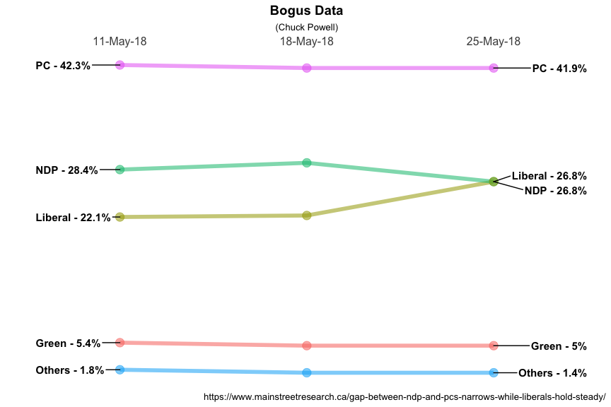
Very nice! We have confirmed that our solution works for more than two dates without any additional changes and we have found a solution to the label overlap issue. In a little while we’ll talk about labeling the data points in the center (if we want to).
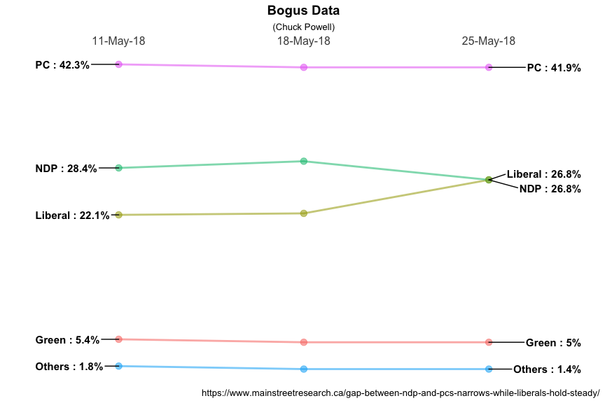
Before we move on let’s make our life a little simpler. While the output plot is good it’s a lot of code to produce one graph. Let’s see if we can simplify…
Since ggplot2 objects are just regular R objects, you can put them in a list. This means you can apply all of R’s great functional programming tools. For example, if you wanted to add different geoms to the same base plot, you could put them in a list and use lapply().
But for now let’s at least take all the invariant lines of code and put
them in a list. Then when we go to plot we can just invoke the list and
remain confident we get the right formatting. For now let’s name this
list something quaint and obvious like MySpecial.
MySpecial <- list(
  # move the x axis labels up top
  scale_x_discrete(position = "top"),
  theme_bw(),
  # Format tweaks
  # Remove the legend
  theme(legend.position = "none"),
  # Remove the panel border
  theme(panel.border     = element_blank()),
  # Remove just about everything from the y axis
  theme(axis.title.y     = element_blank()),
  theme(axis.text.y      = element_blank()),
  theme(panel.grid.major.y = element_blank()),
  theme(panel.grid.minor.y = element_blank()),
  # Remove a few things from the x axis and increase font size
  theme(axis.title.x     = element_blank()),
  theme(panel.grid.major.x = element_blank()),
  theme(axis.text.x.top      = element_text(size=12)),
  # Remove x & y tick marks
  theme(axis.ticks       = element_blank()),
  # Format title & subtitle
  theme(plot.title       = element_text(size=14, face = "bold", hjust = 0.5)),
  theme(plot.subtitle    = element_text(hjust = 0.5))
)
summary(MySpecial)
##       Length Class                 Mode
##  [1,] 17     ScaleDiscretePosition environment
##  [2,] 57     theme                 list
##  [3,]  1     theme                 list
##  [4,]  1     theme                 list
##  [5,]  1     theme                 list
##  [6,]  1     theme                 list
##  [7,]  1     theme                 list
##  [8,]  1     theme                 list
##  [9,]  1     theme                 list
## [10,]  1     theme                 list
## [11,]  1     theme                 list
## [12,]  1     theme                 list
## [13,]  1     theme                 list
## [14,]  1     theme                 list
MySpecial is actually an incredibly complex structure so I used the
summary function. What’s important to us is that in the future all we
need to do is include it in the ggplot command and magic happens.
Perhaps another day I’ll make it a proper function but for now I can
change little things like line size or titles and labels without
worrying about the rest. So here it is with some little things changed.
ggplot(data = moredata, aes(x = Date, y = Pct, group = Party)) +
  geom_line(aes(color = Party, alpha = 1), size = 1) +
  geom_point(aes(color = Party, alpha = 1), size = 3) +
  geom_text_repel(data = moredata %>% filter(Date == "11-May-18"),
                  aes(label = paste0(Party, " : ", Pct, "%")) ,
                  hjust = "left",
                  fontface = "bold",
                  size = 4,
                  nudge_x = -.45,
                  direction = "y") +
  geom_text_repel(data = moredata %>% filter(Date == "25-May-18"),
                  aes(label = paste0(Party, " : ", Pct, "%")) ,
                  hjust = "right",
                  fontface = "bold",
                  size = 4,
                  nudge_x = .5,
                  direction = "y") +
  MySpecial +
  labs(
    title = "Bogus Data",
    subtitle = "(Chuck Powell)",
    caption = "https://www.mainstreetresearch.ca/gap-between-ndp-and-pcs-narrows-while-liberals-hold-steady/"
  )
Even more complex
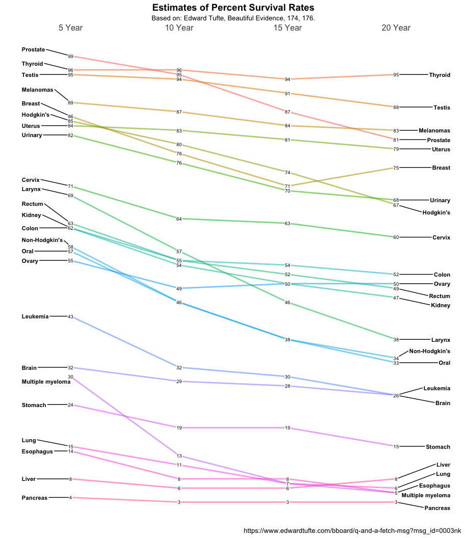
Feeling good about the solution so far I decided to press on to a much more complex problem. Thomas J. Leeper has a nice plot of Tufte’s Cancer survival slopegraph N.B. that the original Tufte is not accurate on the vertical scale. Look at Prostate and Thyroid for example since visually I would argue they should cross to reflect the data.
Let’s grab the data as laid out by Tufte.
cancer <- structure(list(Year.5 = c(99, 96, 95, 89, 86, 85, 84, 82, 71, 69, 63, 62, 62, 58, 57, 55, 43, 32, 30, 24, 15, 14, 8, 4),
                         Year.10 = c(95, 96, 94, 87, 78, 80, 83, 76, 64, 57, 55, 54, 55, 46, 46, 49, 32, 29, 13, 19, 11, 8, 6, 3),
                         Year.15 = c(87, 94, 91, 84, 71, 74,  81, 70, 63, 46, 52, 50, 54, 38, 38, 50, 30, 28, 7, 19, 7, 8, 6, 3),
                         Year.20 = c(81, 95, 88, 83, 75, 67, 79, 68, 60, 38, 49, 47, 52, 34, 33, 50, 26, 26, 5, 15, 6, 5, 8, 3)),
                    class = "data.frame",
                    row.names = c("Prostate", "Thyroid", "Testis", "Melanomas", "Breast", "Hodgkin's", "Uterus", "Urinary", "Cervix", "Larynx", "Rectum", "Kidney", "Colon", "Non-Hodgkin's", "Oral", "Ovary", "Leukemia", "Brain", "Multiple myeloma", "Stomach", "Lung", "Esophagus", "Liver", "Pancreas"))

str(cancer)
## 'data.frame':    24 obs. of  4 variables:
##  $ Year.5 : num  99 96 95 89 86 85 84 82 71 69 ...
##  $ Year.10: num  95 96 94 87 78 80 83 76 64 57 ...
##  $ Year.15: num  87 94 91 84 71 74 81 70 63 46 ...
##  $ Year.20: num  81 95 88 83 75 67 79 68 60 38 ...
kable(head(cancer,10)) %>%
  kable_styling(bootstrap_options = c("striped", "hover", "condensed", "responsive"))
| Year.5 | Year.10 | Year.15 | Year.20 | |
|---|---|---|---|---|
| Prostate | 99 | 95 | 87 | 81 |
| Thyroid | 96 | 96 | 94 | 95 |
| Testis | 95 | 94 | 91 | 88 |
| Melanomas | 89 | 87 | 84 | 83 |
| Breast | 86 | 78 | 71 | 75 |
| Hodgkin’s | 85 | 80 | 74 | 67 |
| Uterus | 84 | 83 | 81 | 79 |
| Urinary | 82 | 76 | 70 | 68 |
| Cervix | 71 | 64 | 63 | 60 |
| Larynx | 69 | 57 | 46 | 38 |
There, we have it in a neat data frame but not organized as we need it.
Not unusual, and an opportunity to use some other tools from broom and
reshape2. Let’s do the following:
- Let’s transpose the data with
t - Let’s use
broom::fix_data_frameto get valid column names and convert rownames to a proper column all in one function. Right now the types of cancer are nothing but rownames. - Use
reshape2::meltto take our transposed dataframe and convert it to long format so we can send it off toggplot. Along the way we’ll rename the resulting dataframenewcancerwith columns namedYear,TypeandSurvival.
# stepping through for demonstration purposes
t(cancer) # returns a matrix
##         Prostate Thyroid Testis Melanomas Breast Hodgkin's Uterus Urinary
## Year.5        99      96     95        89     86        85     84      82
## Year.10       95      96     94        87     78        80     83      76
## Year.15       87      94     91        84     71        74     81      70
## Year.20       81      95     88        83     75        67     79      68
##         Cervix Larynx Rectum Kidney Colon Non-Hodgkin's Oral Ovary
## Year.5      71     69     63     62    62            58   57    55
## Year.10     64     57     55     54    55            46   46    49
## Year.15     63     46     52     50    54            38   38    50
## Year.20     60     38     49     47    52            34   33    50
##         Leukemia Brain Multiple myeloma Stomach Lung Esophagus Liver
## Year.5        43    32               30      24   15        14     8
## Year.10       32    29               13      19   11         8     6
## Year.15       30    28                7      19    7         8     6
## Year.20       26    26                5      15    6         5     8
##         Pancreas
## Year.5         4
## Year.10        3
## Year.15        3
## Year.20        3
broom::fix_data_frame(
   t(cancer),
   newcol = "Year") # make it a dataframe with Year as a proper column
##      Year Prostate Thyroid Testis Melanomas Breast Hodgkin.s Uterus
## 1  Year.5       99      96     95        89     86        85     84
## 2 Year.10       95      96     94        87     78        80     83
## 3 Year.15       87      94     91        84     71        74     81
## 4 Year.20       81      95     88        83     75        67     79
##   Urinary Cervix Larynx Rectum Kidney Colon Non.Hodgkin.s Oral Ovary
## 1      82     71     69     63     62    62            58   57    55
## 2      76     64     57     55     54    55            46   46    49
## 3      70     63     46     52     50    54            38   38    50
## 4      68     60     38     49     47    52            34   33    50
##   Leukemia Brain Multiple.myeloma Stomach Lung Esophagus Liver Pancreas
## 1       43    32               30      24   15        14     8        4
## 2       32    29               13      19   11         8     6        3
## 3       30    28                7      19    7         8     6        3
## 4       26    26                5      15    6         5     8        3
reshape2::melt(
   broom::fix_data_frame(
      t(cancer),
      newcol = "Year"),
   id="Year", variable.name="Type", value.name = "Survival") # melt it to long form
##       Year             Type Survival
## 1   Year.5         Prostate       99
## 2  Year.10         Prostate       95
## 3  Year.15         Prostate       87
## 4  Year.20         Prostate       81
## 5   Year.5          Thyroid       96
## 6  Year.10          Thyroid       96
## 7  Year.15          Thyroid       94
## 8  Year.20          Thyroid       95
## 9   Year.5           Testis       95
## 10 Year.10           Testis       94
## 11 Year.15           Testis       91
## 12 Year.20           Testis       88
## 13  Year.5        Melanomas       89
## 14 Year.10        Melanomas       87
## 15 Year.15        Melanomas       84
## 16 Year.20        Melanomas       83
## 17  Year.5           Breast       86
## 18 Year.10           Breast       78
## 19 Year.15           Breast       71
## 20 Year.20           Breast       75
## 21  Year.5        Hodgkin.s       85
## 22 Year.10        Hodgkin.s       80
## 23 Year.15        Hodgkin.s       74
## 24 Year.20        Hodgkin.s       67
## 25  Year.5           Uterus       84
## 26 Year.10           Uterus       83
## 27 Year.15           Uterus       81
## 28 Year.20           Uterus       79
## 29  Year.5          Urinary       82
## 30 Year.10          Urinary       76
## 31 Year.15          Urinary       70
## 32 Year.20          Urinary       68
## 33  Year.5           Cervix       71
## 34 Year.10           Cervix       64
## 35 Year.15           Cervix       63
## 36 Year.20           Cervix       60
## 37  Year.5           Larynx       69
## 38 Year.10           Larynx       57
## 39 Year.15           Larynx       46
## 40 Year.20           Larynx       38
## 41  Year.5           Rectum       63
## 42 Year.10           Rectum       55
## 43 Year.15           Rectum       52
## 44 Year.20           Rectum       49
## 45  Year.5           Kidney       62
## 46 Year.10           Kidney       54
## 47 Year.15           Kidney       50
## 48 Year.20           Kidney       47
## 49  Year.5            Colon       62
## 50 Year.10            Colon       55
## 51 Year.15            Colon       54
## 52 Year.20            Colon       52
## 53  Year.5    Non.Hodgkin.s       58
## 54 Year.10    Non.Hodgkin.s       46
## 55 Year.15    Non.Hodgkin.s       38
## 56 Year.20    Non.Hodgkin.s       34
## 57  Year.5             Oral       57
## 58 Year.10             Oral       46
## 59 Year.15             Oral       38
## 60 Year.20             Oral       33
## 61  Year.5            Ovary       55
## 62 Year.10            Ovary       49
## 63 Year.15            Ovary       50
## 64 Year.20            Ovary       50
## 65  Year.5         Leukemia       43
## 66 Year.10         Leukemia       32
## 67 Year.15         Leukemia       30
## 68 Year.20         Leukemia       26
## 69  Year.5            Brain       32
## 70 Year.10            Brain       29
## 71 Year.15            Brain       28
## 72 Year.20            Brain       26
## 73  Year.5 Multiple.myeloma       30
## 74 Year.10 Multiple.myeloma       13
## 75 Year.15 Multiple.myeloma        7
## 76 Year.20 Multiple.myeloma        5
## 77  Year.5          Stomach       24
## 78 Year.10          Stomach       19
## 79 Year.15          Stomach       19
## 80 Year.20          Stomach       15
## 81  Year.5             Lung       15
## 82 Year.10             Lung       11
## 83 Year.15             Lung        7
## 84 Year.20             Lung        6
## 85  Year.5        Esophagus       14
## 86 Year.10        Esophagus        8
## 87 Year.15        Esophagus        8
## 88 Year.20        Esophagus        5
## 89  Year.5            Liver        8
## 90 Year.10            Liver        6
## 91 Year.15            Liver        6
## 92 Year.20            Liver        8
## 93  Year.5         Pancreas        4
## 94 Year.10         Pancreas        3
## 95 Year.15         Pancreas        3
## 96 Year.20         Pancreas        3
# all those steps in one long line saved to a new dataframe
newcancer <- reshape2::melt(broom::fix_data_frame(t(cancer), newcol = "Year"), id="Year", variable.name="Type", value.name = "Survival")
Now we have whipped the data into the shape we need it. 96 rows with the
three columns we want to plot, Year, Type, and Survival. If you
look at the data though, you’ll notice two small faults. First, Year
is not a factor. The plot will work but have an annoying limitation.
Since “Year.5” is a character string it will be ordered after all the
other years. We could fix that on the fly within our ggplot call but I
find it cleaner and more understandable if I take care of that first.
I’ll use the factor function from base R to accomplish that and
while I’m at it make the values nicer looking. Second in three cases R
changed cancer type names because they couldn’t be column names in a
dataframe. I’ll use forcats::fct_recode to make them look better.
newcancer$Year <- factor(newcancer$Year,
                         levels = c("Year.5", "Year.10", "Year.15", "Year.20"),
                         labels = c("5 Year","10 Year","15 Year","20 Year"),
                         ordered = TRUE)
newcancer$Type <- forcats::fct_recode(newcancer$Type,
                                      "Hodgkin's" = "Hodgkin.s",
                                      "Non-Hodgkin's" = "Non.Hodgkin.s",
                                      "Multiple myeloma" = "Multiple.myeloma")
head(newcancer)
##      Year     Type Survival
## 1  5 Year Prostate       99
## 2 10 Year Prostate       95
## 3 15 Year Prostate       87
## 4 20 Year Prostate       81
## 5  5 Year  Thyroid       96
## 6 10 Year  Thyroid       96
Now that we have the data the way we want it we can make our slopegraph.
Some of the necessary changes are obvious x = Year, y = Survival and
group = Type for example. Since there are a lot of plotted lines I’ve
reduced the weight or size of the individual lines. We no longer want to
plot the big round points, we’re going to substitute in the actual
numbers, so that line gets commented out. The left and right labels
require no change and geom_text_repel will keep them from overlapping
which is almost inevitable given the data. To put the actual survival
numbers on the plot we’ll turn to geom_label. It’s like geom_text
only it puts a label box around the text. We’ll choose a smallish size,
minimize the amount of padding, and make the border of the box
invisible. The end result is what we want. It overlays on top of the
lines we’ve already plotted and the invisible padding gives us just
enough room.
ggplot(data = newcancer, aes(x = Year, y = Survival, group = Type)) +
  geom_line(aes(color = Type, alpha = 1), size = 1) +
#  geom_point(aes(color = Type, alpha = .1), size = 4) +
  geom_text_repel(data = newcancer %>% filter(Year == "5 Year"),
                  aes(label = Type) ,
                  hjust = "left",
                  fontface = "bold",
                  size = 3,
                  nudge_x = -.45,
                  direction = "y") +
  geom_text_repel(data = newcancer %>% filter(Year == "20 Year"),
                  aes(label = Type) ,
                  hjust = "right",
                  fontface = "bold",
                  size = 3,
                  nudge_x = .5,
                  direction = "y") +
  geom_label(aes(label = Survival),
             size = 2.5,
             label.padding = unit(0.05, "lines"),
             label.size = 0.0) +
  MySpecial +
  labs(
    title = "Estimates of Percent Survival Rates",
    subtitle = "Based on: Edward Tufte, Beautiful Evidence, 174, 176.",
    caption = "https://www.edwardtufte.com/bboard/q-and-a-fetch-msg?msg_id=0003nk"
  )
Done for now
I hope you’ve found this useful. I am always open to comments, corrections and suggestions.
Chuck (ibecav at gmail dot com)
License

This
work is licensed under a
Creative
Commons Attribution-ShareAlike 4.0 International License.